I was able to work on my first commission for creating comic layouts, for peckybird (on tumblr, insta.). They gave me a script and description of a scene featuring their OCs, and I was able to break down the scene into four pages. I thought I would show a little bit of how that process went!
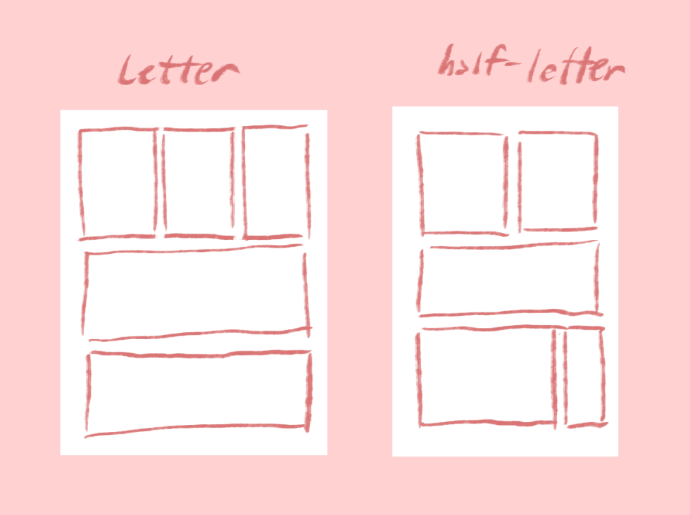
First was determining what proportions we would be working with. I offered a couple of the more common proportions, I’m accustomed to doing layouts on, namely the US Letter size (8.5”x11”) page and the half-letter page (5.5”x8.5”). We ended up going with the half-letter page.
Then it was down to breaking down the script itself. The scene in question was a small part of a longer scene, and peckybird sent me a lot of other information, about the characters, their appearance, and history, that was very helpful in determining the mood and emotions to communicate in the scene. The characters in question have a complicated past relationship of love and frustration, and while the scene doesn’t get into everything, I definitely wanted to keep it in mind while planning out the scene.
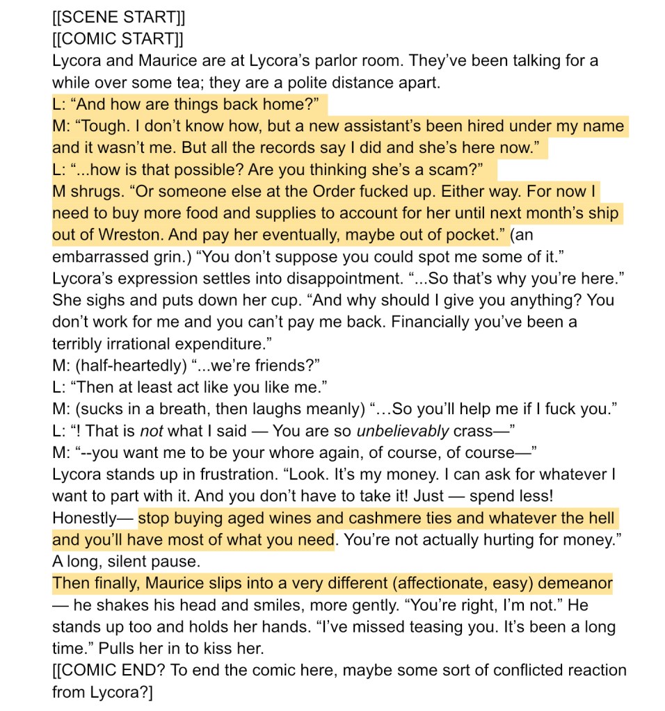
Here’s the full text of the scene that I was given. There were also additional notes on the highlighted aspects with suggestions for how the scene could look like—for example, for some of the wordier sentences, I could possibly cut down or edit out some words for the sake of flow in the visual medium.
Since there’s a lot of important dialogue contextualizing the scene, I wanted to make sure that there would be enough room for the text in doing the layout. Here I just entered the text using the Clip Studio paint text function to sort of gauge how much space it would take up with the word balloons. It’s not perfect lettering, but I tried to break it up into a way that the person using these thumbnails as a guide would be able to plan where to place their own lettering.
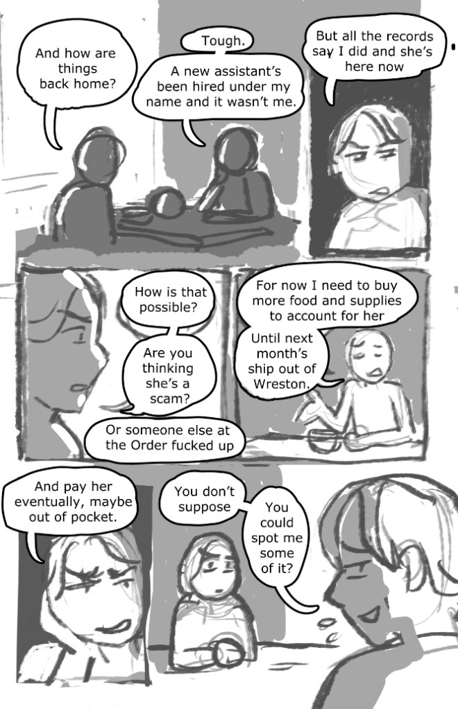
Since this is the first page of the comic, I wanted to start off the page with something that establishes the relationship between the characters, so there’s a panel with both characters in it, with the table between them. I also communicated that there is enough room in the back for if the artist wants to possibly do a more detailed background to show their environment; however, they could also keep it simple as well if they wanted to keep the emphasis on the characters. Small panels with a focus on the face and expressions don’t need such detailed backgrounds since they are mostly communicating emotion.
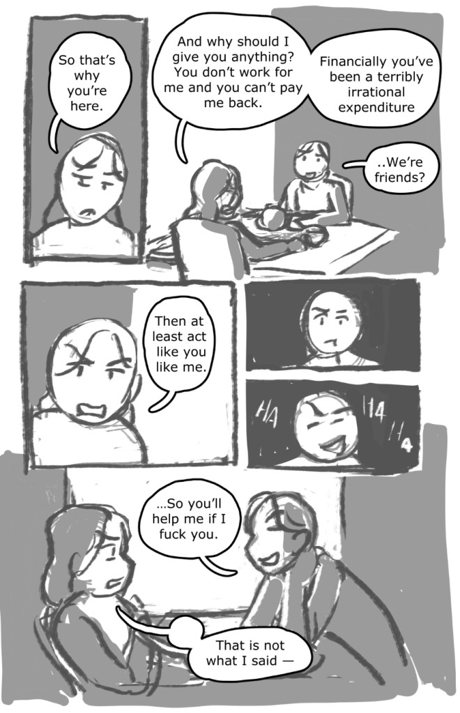
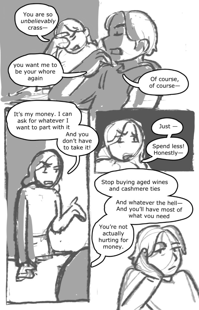
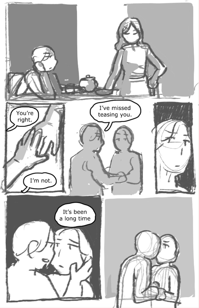
The sort of “movement” of the scene goes from something more calm to more heightened, before calming down again, so the panels and character actions reflect this. The third page is where the most heightened emotion is, so the panels also kind of break out of the usual row divided into thirds to emphasize it, before kind of returning back to more restrained panels on the last page.
As you can see, these thumbnails are very rough, but I do my best to make sure they are clear to read, as well as being adaptable to the artist’s art style and abilities! It’s definitely very different than doing thumbnails in which I am the only person for whom it is necessary to read the thumbnails. When the final comic is finished, I will definitely be linking back to it as well when I’m able!
If you are an artist interested making comics, and working with me to help adapt your script or ideas into a comic format, feel free to check out my page for it here! I’d love to work more with people and their stories.
