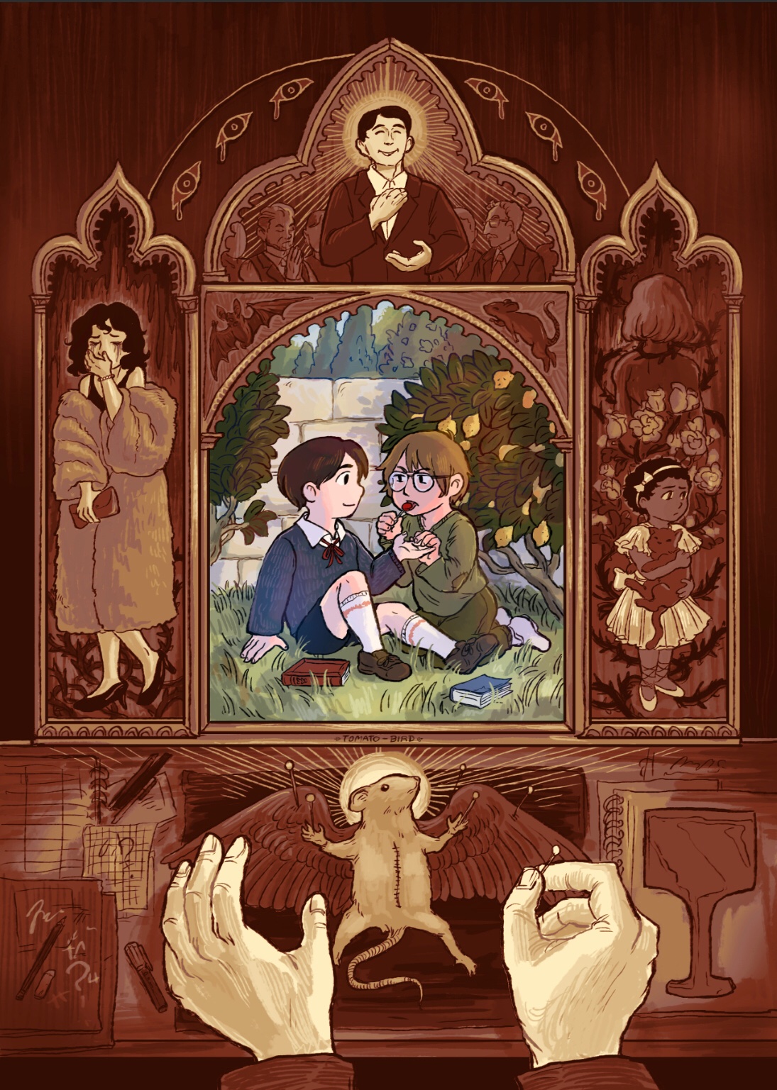
“All Things Bright and Beautiful, All Creatures Great and Small”
Illustration I completed for a collaborative The Batman (2022) Zine last year, titled “What Batman Movie Did You Watch?” a fun little reclamation of the meme making fun of fans doing romantic fanart of Batman and the Riddler. I was glad to contribute ot this project because the fun part about fandom is how sometimes, fans can take concepts from a story or movie, and just transform it in some wild directions that may diverge immensely and indulgently from the source material, but call back to it in creative and clever ways that reveal the things that resonated with us.
The zine itself is on pause, but we received permission to post our pieces for this time. I wanted to do a gothic inspired piece with lots of fun details relating to the movie, but with a sort of vintage storybook vibe. I always love illustrations where you can find more details the more you look at it, and that’s the experience I wanted to convey with this piece.
For mood inspiration, some of my favorite middle grade and YA books a while back were historical inspired fiction by Frances Hardinge such as The Lie Tree and Fly By Night that have very whimsical vibes but also a sense of unsettling themes about secrets and discovery that fit the feelings I wanted to convey in this. Batman stories always have a kind of Victorian Dickensian tale feel to them that the newest movie dipped into a bit, so I wanted to explore that tiny bit more.
On Patreon last year, I also included a breakdown of the process of how I did this illustration, and I can share it here now too!
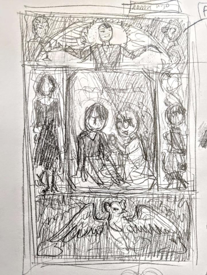
Thumbnails and Rough Sketches
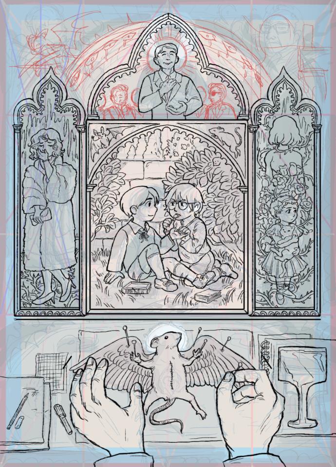
First, I started off with a very rough sketch, this is just pencil on scrap paper. Usually at this stage in making an illustration, I have 10000 different concepts I want to include in a single picture and I try to see how I can fit all of it in. The basic elements are all here, but they’ll shift over time as I plot it out.
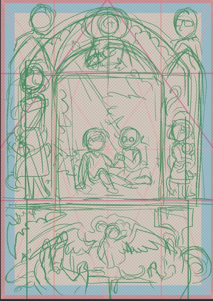
Later, I plot it all on a digital canvas to roughly get a sense of where everything will go on the actual size and proportions of the page. For this zine, we were provided with PSD files that laid out the borders etc for us already, so I just worked with that. I used a sort of diagonal grid to help figure out quickly where the center of everything was and worked from there.
Cleaner sketches
Everything is more detailed here and coming together. I still had the heads in the top left and right corners; i eventually took them out since I couldn’t make them fit in the kind of “frame” look I wanted to do. Also, I realized I wanted to do more deliberate with the borders of the frames themselves rather than them just being divisions between the characters.
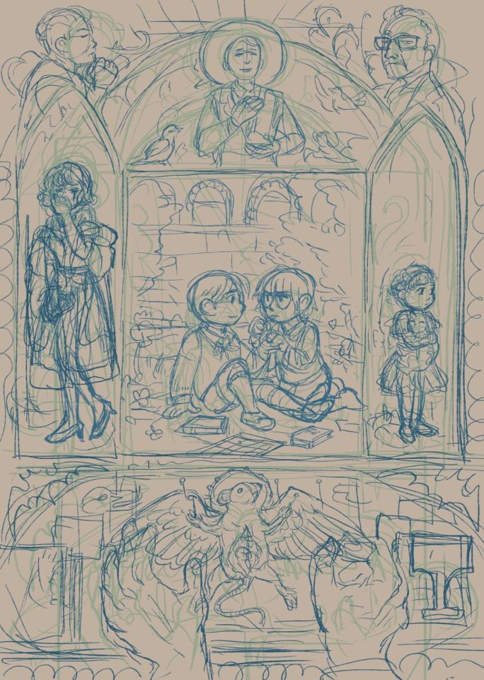
I also did more of a “value sketch, figuring out the value relationships in the composition. I probably should have done this earlier; one of the things I’ve learned from the past year is that while I usually put a lot of time and thought into the position of elements on the page, I need to think more about the overall impression of how things will look early on, specifically in using value and dark/light areas to create areas of focus.
Very stylized altar-like central compositions like this feel a little bit like “cheating” to me, because the rigid setup of it and religious connotations automatically tells you where to look, but value is still important in the image.

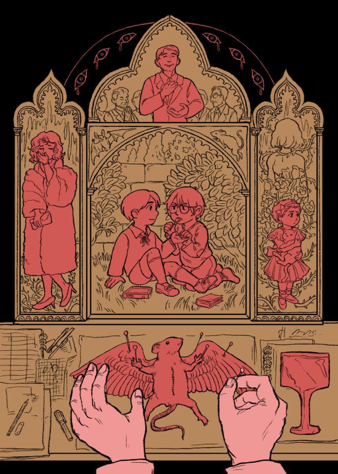
Line Art and Reference
Here I started doing the line art. I did all the figures on separate layers. I also around this time realized I wanted to give more character to the “panels” and spent a lot of time looking at gothic altarpieces, especially this one. Once again I used diagonal grids to figure out how to center the elements.

Around this time I got rid of the floating heads for good. They just seemed a little too distracting for me, and since I was referencing the altarpiece patterns more it felt weirf for them to be sort of floating “outside” of the frames I’d created. I reduced them to more tinier heads on either side of Thomas Wayne on the top. In various Medieval and Renaissance artwork, not to mention in ancient art, the size of figures often relates to hierarchy both of the figures themselves and the amount of attention the audience is supposed to give to them, so it felt like a natural solution.
Doing the Line Art is the aspect of illustrating that usually is my favorite after I’ve figured out all the plotting and compositing–I know a lot of artists dread or despise it, but it’s my favorite part of the process, so relaxing after being done with all the thinking!!! Since I was intending on coloring and painting this, my line art approach was fairly simple and clean, not trying to make any ambitious effects. This reminds me a lot of my days working on coloring book illustrations.
Coloring
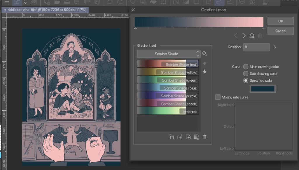
Moving on to adding color! Once again, this is another stage where I was like “I probably should have planned how I wanted this to look before I did it.” To make things easier for myself I flatted the main figures and elements once again on their separate layers.
My documentation is a bit weird here since I spent most of this time noodling around trying to see what would work. But using my value sketch from earlier, I colored the whole thing in grey-scale to see everything laid out in pure black and white value. After that, I could play around with what color schemes I wanted for the entire piece.
Here’s a screenshot of me playing with a gradient map adding some slight pink and blue tone to my greyscale version of the image. I still like this simple version a lot on its own actually….
Deciding on colors. Going with that vintage vibe once more, I used another gradient map to set everything to a kind of sepia tone. I made a mask for the center part which I painted more in color, wanting to go with warm and nostalgic vibes.
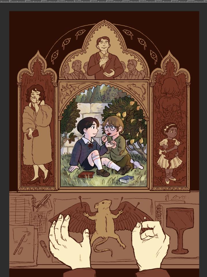
Because of the gradient map, I was basically just shading/rending everything in greyscale. Mostly I focused on creating a sense of texture so it didn’t look so digitally “clean”. I also added touch up details like the eyes and halo beams, but the majority of it was just regular BW rendering. I also noodled around with adding some gradients on top to make it darker, and some screen filter layers to adjust the color, but these are always very minimal.

Like most pieces, I’m generally pretty happy with the result–I got to put a lot of time into this and I was excited for the project. For what I learned while working on it, is probably to have a better sense of the values starting off, since that would probably have made the rest of the process smoother, and I could spend less time feeling a bit lost between steps.
As mentioned before, the zine “What Batman Movie Did You Watch” is on indefinite pause for now, but worth checking out to see some very creative artwork and designs.
In addition, I have also created my own Riddlebat Zine, “This is NOT How it Was Supposed to GO,” which is free on itch.io, and includes my comic “The Boy From the Tower.” .
